The Workflow Graphic: An Example
Recently, I was tasked to grab an image from a powerpoint presentation for something I was documenting. But when I looked at the overall presentation, a completely unrelated graphic caught my eye, and I knew I could make it better. Not only that, I could use this one image to explain an entire workflow to the end user, as it was the basis for the entire presentation. It outlined the whole workflow, from start to finish. Note: Names were changed to protect the SMEs.
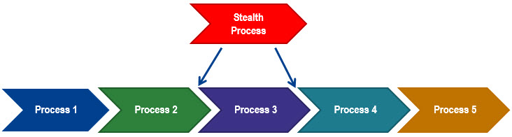
Looking at the image, I could clearly see that the author wanted to differentiate from one process to the next. The colors clearly told me that. And the arrows obviously showed that this was a flow diagram. But it also looked like a unicorn from the 1960’s smashed right through it. There is no clear reason for the color choices, except that they are bold and loud. Furthermore, that “Stealth Process” was no different than any of the other processes in the chain of events. However, when red is used for the arrow object’s fill color, the message being sent is that this process is dangerous or volatile. At best, it is a statement that this process is much more important than all the others. This was clearly not the message the author wanted to convey.
FInally, it looks like some of these arrow objects are outlined, while some are not. That tells your end user that you don’t have your attention on the details. And while it’s an honest mistake, it has the potential to feed into a perception that you (and worse, your company) is hasty and sloppy, even though we all know that’s not true. Why chance that false perception?
Let me backtrack for a second. Anytime I look at any image for marketing, presentation, documentation, or otherwise, the first question I ask is “what?” and “why?” What is the idea you are presenting? And why are you presenting this idea? In this case, the idea was to present a workflow process, and it was being presented to explain a very complex multi-process application to a group of people that may or may not understand it.
This means the first task is to make sure all the processes are there, and the “content” is in place. After a bit of research, I realized there were some pre-process points that needed to be explained before starting Process 1. Also, Process 5 could branch in two directions. There was also a post-Process 5 step that was missed, and an alternate process step in the middle that was missed. Lastly, I wanted to ensure that the most important tangential information about these processes were put directly in the image. These are the points that are absolutely crucial to working through the flow accurately, so it was vital they became part of the graphic.
A quick note about text inside graphics or images. If you are using the graphic or image in a document or on the web, keep in mind that this text IS NOT searchable by the end user. Therefore, it is always a good idea to ensure that this same text exists somewhere else, either in the text on the page or in the graphic or image meta information, which usually is searchable.
With the content in place, the next step focused on the “how?” This is the step in the graphic creation process where you look at the presentation itself. The most crucial question you need to ask is this: “Does each part of the presentation further the message?” If the answer is no, then don’t add it into the mix. If, on the other hand, the answer is yes, then you’re on the right track.
For example, in the original, the colors don’t add to the message. In fact, it could be argued they detract from it. They overpower the text itself and don’t provide any meaning to the message except to say that each step is unique. In the revised graphic, I took the approach that we stick with one color (the appropriate branding color for the company made sense because that reinforces the message). Then, I made it flow from a lighter color at Process 1, all the way up through a darker color, until you finally arrive on black for post-process 5. This reinforces the flow/direction of the processes overall. Again, this reinforces the message. It’s all one color to reinforce a single process, but the color tints reinforce the idea of progress from one process to the next, until a final destination is reached.
Here is the revised workflow image:
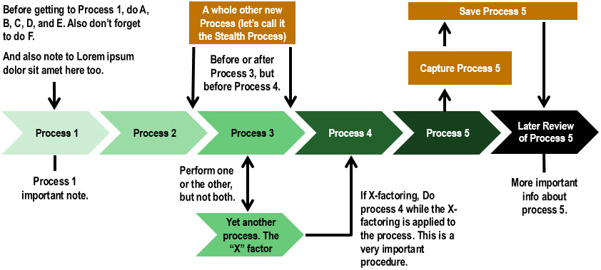
You’ll notice that we’ve provided some context before we enter Process 1. This would be anything the end user needs to know before they start going down the garden path. You’ll also see that there’s an odd Stealth process that can happen before or after Process 3. I chose to make this stealth process color different from the rest, and I also made the Process 5 branch processes the same orange color. This has the effect of keeping those steps segregated from the main workflow. They are still integral, but secondary to the main flow.
The “X” factor process was a bit more unique. This is still a big part of the workflow, as it’s an alternate process for Process 3. So the decision was made to keep it the exact same color as Process 3. Again, the color adds to the meaning of the message. Even making the lines and arrows black, and with a heavier weight, were conscious decisions. The lines are an important part of the message, so they need to be crisp and readable. But they also need to be a secondary support to the text messaging. Making them black and a bit thicker achieves both these ends.
The two text points for Process 1 and Process 5, respectively, don’t require arrows since they are merely notations, and not integral to the workflow. In fact, I may still change the text color to a lighter gray since these were more “tip notes” than important points. If they were crucial points of safety, for example, you may want to color them red or make them bold. This conveys a high degree of emphasis. There are plenty of ways to use color and line weights to convey meaning. Use these features wisely.
If a picture is worth a thousand words, how much is a well-designed graphic worth? That’s where you come in. Always ensure it conveys the right message, and question everything about it to ensure all aspects lend itself to strengthening that message. Lastly, just as you would go over your copy to make sure it is free of grammatical mistakes, typos, and syntax errors, do the same with your graphics. Paying attention to the little details builds the perception of professionalism that you want to foster for both yourself and your company.
Let me know if you have any other ideas or thoughts on how you put together graphics, or if you have anything else you’d like me to discuss.
Excellent work Rob, the changes you made are clearly making it better. Awesome job.
Thanks Ed. As with everything in life, it’s a work in progress. There are still a few changes I would make to it, but overall I think it’s an improvement. Thanks for your kind words.